How We Designed The Fastvue Dashboard
by

Scott Glew

About six months ago we embarked on a project to design a real time dashboard that helps network administrators quickly answer the question - What is going on in my network right now?
This simple question can have many, often complex answers, and the current tools in the market usually added to this complexity, and/or only answered a small portion of the question.
So we set out on our mission to create a simple, yet useful real time network monitoring solution.
Where to start?
In the wise words of Arnold Schwarzenegger:

"I'm gonna ask you a bunch of questions, and I want to have them answered immediately!"
- Kindergarten Cop
The Arnie quote above has become a catch phrase at Fastvue. In order to answer the question 'What is going on in my network', we realized that there are many sub-questions that need to be answered first. And in the real-time game, network administrators really do want them answered immediately!
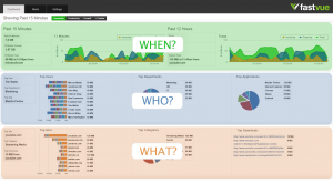
To help simplify the problem, we decided to categorize these questions into the typical question types: Who, What, When, Where, How and Why.
Who?
Making a list of 'who' questions was pretty straight forward. There's really just one that we cared about:
- Who is using my network right now?
The answers to this question can vary depending on the organization. For example, 'who' could be an employee, a student, a teacher or a volunteer worker. Organizations of any decent size talk in terms of 'groups of users', so 'who' could also be a department or branch office for example.
Fortunately, our customers use a product called Active Directory to manage their employees, departments, and so on. Leveraging this information therefore became a significant part of our development plan.
What?
The list of 'what' questions was certainly the most extensive:
- What sites are being accessed?
- What applications are being used?
- What computers or IPs are being used?
- What viruses have been detected? And what computers have they come in contact with?
- What is being blocked by my firewall?
- What is not being blocked by my firewall?
- What intrusions have been detected?
- What files are being downloaded?
- What website categories are accessed the most?
- What protocols are in use?
- What ports are in use?
- What are the top connections?
- ... the list goes on.
In making this list, it soon became apparent that there was no way we could sensibly answer all of these questions on a single dashboard or screen. After some thought, we discovered that all of these questions fell into one of three main groups - Bandwidth, Productivity, or Firewall. We therefore decided to create three dashboards - one for each group.
We didn't like the idea of the context switch involved in visiting different pages to get an overall sense of what was going on, and it was important to us that the switch was as seamless and as fluid as possible. More on this later.
When?
'When' is an interesting concept when dealing with real time. What does 'right now' actually mean? Are you interested in viewing traffic only for the past 1 minute? What if the network is experiencing issues, and by the time you hit our application the problem is gone? We decided that to get a good feel for what is happening in your network, we should extend our question to 'What has been happening recently'. With this in mind we decided to focus on the past 15 minutes.
But then we thought about the 'when' questions people ask:
- When is my network being used the most? The least?
- When did the largest downloads occur?
- When did a network threat occur?
- When was someone browsing unproductively?
This got us thinking that perhaps even the past 15 minutes is not enough. Network admins are not going to watch charts all day. They will most likely visit our application once or twice a day. After talking to many potential users about this situation during our beta period, we decided to focus our application on the past 12 hours, with three charts showing the past 15 minutes for bandwidth, productivity and firewall activity.
Where?
We based the 'where' questions purely around physical location, rather than 'where are people going online' as this was already covered in our 'what' questions.
- Where are people located right now? In the office? on mobile? connected via VPN? Which country, city or state?
- Where are the sites located that people are accessing. China? Russia?
Our user research later indicated that these questions were not highly critical to providing insight into network performance. We therefore addressed these questions in part via our integration with Active Directory (you can alert on Office, Department and Country), and via our Applications list (For example, Mobile Safari indicating iPhones). However, a more holistic view of source and destination locations is still on the roadmap and we have some pretty exciting ideas for it too!
How?
After excluding questions already asked in some form in the lists above, our list of 'How' questions ultimately came down to just one major question:
- How are people using the Internet? Are they using it for work purposes, or are they just goofing off?
We realized that what classifies as 'goofing off' for one company, might actually be deemed productive behavior in another. For example, if you work in a travel agency, it would be quite acceptable to lookup the details of an exotic holiday destination. Not so much if you're a receptionist for an accounting firm. The ability to easily customize the productivity assessment was therefore very important to us.
Fastvue Productivity Icons (Unacceptable, Unproductive, Acceptable and Productive)
We also knew that there are many grey areas when it comes to web browsing productivity, and most companies have a reasonable tolerance for personal browsing.
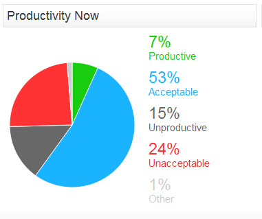
Rather than deeming sites as either Productive or Unproductive, we decided to expand this categorization to Unacceptable, Unproductive, Acceptable, and Productive. We felt it was important to make the distinction between unacceptable and unproductive (pornography vs social networking for example), and also to provide an 'acceptable' list of categories that are neither productive or unproductive. And of course certain white listed categories can simply be deemed Productive.
Why?
Ah yes. Why? That ol' chestnut. Assuming we could answer the questions above, most of the 'why' questions were already covered. Such as:
- Why is there so much traffic being downloaded right now?
- Why is streaming video slower at 10am in the morning?
- Why can't I access a particular website?
There is also a 'why' question that involves user intent. That is, why is a user browsing a particular site? Are they there to purchase something? Did they get referred there by a tweet or facebook post? Are they researching something or just goofing off? What did they do afterwards? Some pretty interesting ideas came out of our brain storming sessions as to how we could go about this, but they did not make it into the initial application. You'll see some of them in version 2.0 though!
Lessons in Dashboard Design
So we had an extensive list of all the questions our app needed to answer, plus some extra functionality that we knew we needed for the application to be successful. Great. Now we just needed to find a way to present this information as effectively as possible.
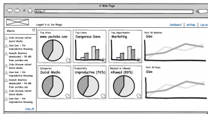
I had been thinking about this product and its interface for some time and I just needed to get it out of my head and into reality as quickly as possible. I knew I needed a dashboard showing top users, top sites, top downloads, top categories and some other key stats. So I headed to balsamiq.com and put together this mockup:
One idea I wanted to communicate with this mockup was the chart titles. Each chart has two titles and the larger title indicates the top item in the chart. For example, the first chart has a small title saying 'Top Sites' followed by a larger title 'www.youtube.com'. The idea is that a network admin can, at a glance, see the top culprits that may be attributing to network issues right now. The eye is attracted to the value 'www.youtube.com or 'Dangerous Dave', or 'Marketing' and then your eye picks up the surrounding text telling you it is the top site, user or department.
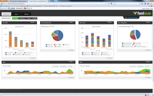
I wasn't overjoyed with my mockup, but I didn't want to waste time in wireframe land either. Inspired by the html prototyping process at 37 Signals, I decided to jump straight into HTML. I found a pretty cool charting library that didn't involve Flash (also something that was important to us from the early stage), and with some HTML, css and javascript magic, I hacked together the first prototype of the Fastvue Dashboard:
As you can see, it's quite different to the initial mockup. I removed a lot of information and rearranged the charts. The chart titles still show the top items for that particular chart, but I simply used the default chart styles which were not exactly eye catching.
The main interface component introduced at this stage was the buttons near the top of the screen to switch between the Bandwidth, Productivity and Firewall dashboards. As I mentioned previously, we wanted this switch to be as fluid as possible, and with a little jQuery magic I soon had the three dashboards sliding in from the side of the screen, with no chunky server post-backs.
I was very happy with this slide in concept, but not all that happy with the charts.
The Usability of a Column Chart
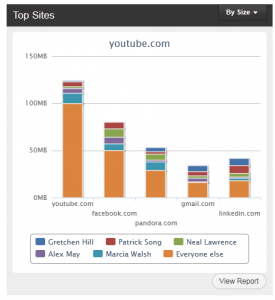 If you look at the first chart for example, it shows the top 5 sites in 5 vertical columns. Each color within the column indicates the top 5 users, with the orange color representing everyone else. My problem with this chart is that it simply isn't easy to discover what the top 5 sites are! The top 5 sites are shown along the horizontal axis in a tiny font. The legend at the bottom is more eye catching, but it represents the top users, not sites.
I also wasn't happy showing only the top 5 sites, but if you increase this to the top 10, then the chart labels would overlap or become insanely small and unreadable.
The sad fact was that a normal table showing a list of the top sites was more usable than this chart. You don't need to scan around a graphic trying to find the information, it's just there in a nice, easy to read list.
But this chart does have one merit. It allows you to evaluate proportions much more easily. If there is a site that is absolutely dominating the list, it stands out in a chart.
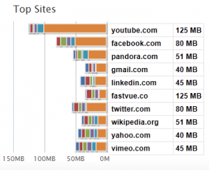
I needed a way to provide an easily readable list of top sites, with the added advantage of being able to visually compare the items in the list. The result; the Fastvue Reverse Bar Chart Table Thingo™.
I'm quite happy with this chart. I don't think it is the most beautiful piece of UI ever, but it is effective. It provides an easy to scan list of top sites, along with a visual indication of the dominating sites. Win Win!
Many Many Sketches...
So with my chart concept down, I embarked on designing each dashboard page in detail.
Some self imposed requirements in the dashboard designs included:
- Must show as much information as possible without being overwhelming or confusing.
- Must allow the user to easily answer the questions identified above with as little eye scanning as possible.
- Must present all information with as little interaction as possible. One use case for our application is for the dashboard to be displayed in an operations center on a large monitor. People looking at the dashboard will not necessarily be able to interact with the information.
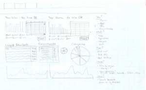
To do this, I employed some state of the art technology - the trusty HB pencil and graph paper!
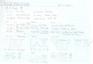
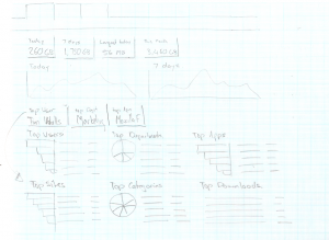
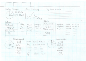
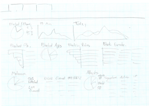
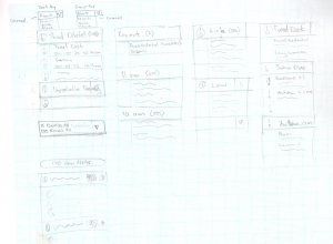
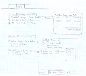
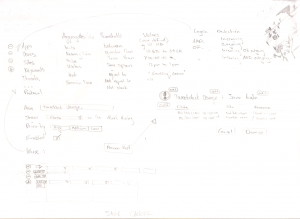
Here are just some of my initial sketches. They probably do not mean much to you, and to be honest, they don't mean much to me now either. But each one got us closer to the application we eventually released.
Dashboard Sketches
This is also proof that you don't need to be able to draw in order to flesh out ideas through sketching!
Alerts Sketches
Back to the code!
Now armed with exactly 1,376,893 different sketches for every permeation of every dashboard, I decided it was time to code it up and soon had this HTML prototype of the Bandwidth Dashboard.
The main improvement here was the structure of information. All the sketching led me to the idea of organizing information in rows, based on the question types we identified. On the Bandwidth Dashboard, the 'when' questions were answered in the top row, followed by the 'who' questions in the middle row, and the 'what' questions in the bottom row.
We were making progress but there were still some problems that needed to be dealt with.
Usability of Pie Charts
The main reason for using pie charts in some sections was to clearly show the percentage a particular item accounted for in relation to the total. For example, what percentage of network traffic is being blocked? Or what percentage of my users are using the web unproductively?
Unfortunately, my pie charts only displayed percentages when hovering over pie slices, and displaying the labels constantly made the charts cluttered and confusing.
I therefore set out to improve the pie charts to clearly show percentages where applicable. The result; the Fastvue Color Coded Large Percentage Labeled Pie Charts of Awesome™.
No Overview
We all agreed that the general information architecture was much improved since making the decision to separate the dashboard into three separate dashboards (Bandwidth, Productivity and Firewall). However, we also felt we lost some of the initial goal of being able to easily see what was going on in your network. We had made switching between the different dashboards a fluid and pleasant experience, but there was no longer one central place to go.
We also felt that each dashboard was becoming cramped. Vertical scrollbars would appear when viewing the dashboard on a standard 13" laptop screen.
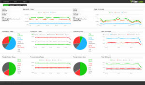
We solved both of these problems with the introduction of our fourth dashboard - the Overview dashboard. We moved the time based charts and the percentage charts from the bandwidth, productivity and firewall dashboards, and created a very useful Overview dashboard that showed a little bit about each of the three main areas. This works quite well. On the Overview dashboard you can tell if there is a large amount of download activity, or unproductive browsing, or firewall activity going on right now. If you need to know more, then all you need to do is click the appropriate dashboard button at the top of the screen, and in it slides.
Minor Tweaks
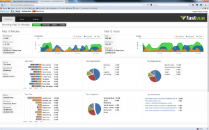
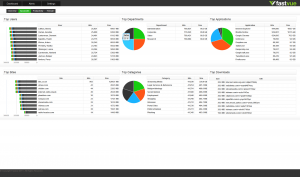
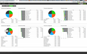
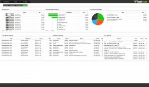
As you can see in the screenshots above, I also brightened up the chart colors, and reduced the size of the tabbed header to give the charts more of the valuable screen real estate. There were also many other considerations and design decisions made before getting to the final product, such as whether to allow user customization or not. That's a blog post for another time. But for now, here are the final four Dashboards as they appeared in our Beta Release:
Overview Dashboard
Bandwidth Dashboard
Productivity Dashboard
Firewall Dashboard
But does it work?
The application we delivered in our beta release does what we set out to do, and does it well. We've delivered a real time network monitoring application where administrators can quickly and easily discover what is going on in their network right now. We are by no means done, and there are still many areas we can improve upon and tweak further. But what we have now is a good start.
It's reassuring to hear the overwhelmingly positive feedback we've received about the application since we launched, and even more reassuring to see some of that feedback turn into real sales dollars. This is the ultimate proof that the application is working, and delivering what we set out to achieve!
Perhaps this is because many of the tools network administrators are used to dealing with have interfaces straight out of 1995?! But either way, we'll take the compliments!
Thanks for reading! Let me know what you think in the comments.
Take Fastvue Reporter for a test drive
Download our FREE 30-day trial, or schedule a demo and we'll show you how it works.
- Share this storyfacebooktwitterlinkedIn
Logging Improvements in Forefront TMG 2010
How To Secure And Publish the Fastvue TMG Reporter Web Site
